Reputation Album Cover
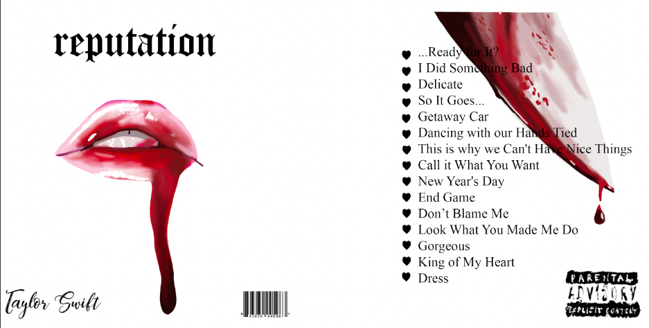
I Feel the strongest part of this piece is the lips with blood dripping down them, as the look fairly realistic and fit well with the overall aesthetic of the album. The design mostly goes with the song "Look What You Made Me Do" as it speaks of her saying she's "dead" and emphasizes that she did something bad due to what her boyfriend did to her (hence the knife and blood coming down the lips). An element of art I used in this piece is color, which is seen in the lips and the knife. I showed color by making the lips filled with bright reds/pinks and the bright reds in the knife. A Principle I used in this piece is contrast. The whites and blacks in the background of the piece contrasts heavily with the reds and pinks of the lips and the red of the knife, which helps emphasize that they are the subject of the piece.
Bad Apple Bar & Grill Logo Redesign
The original logo of Bad Apple Bar & Grill is weird and ineffective in how the apple has apple juice in the background, which doesn't relate to the restaurants name at all (it relates to just the apple aspect not the bad part) and also looks like the apple logo for phones a bit. The Subject matter in these logos are an apple in any shape of form being "bad". The first slide shows an apple as a demon, which in a sense shows its "bad". The second one (which is my favorite) shows a snake portraying Satan from the Adam and Eve story, which therefore means that the apple in its mouth is the one that caused us to have original sin (making it bad). My first logo is effecting because it is simplistic and gets a viewer to realize that it means the apples bad just looking at it. The old logo was very confusing. The second one is effective in that it is pleasing to look at and also portrays the idea of a bad apple.
TIME Magazine Cover
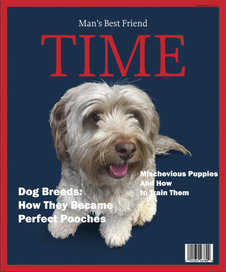
In this project, I used loads of different colors to help the viewers eyes move throughout the whole cover. The white of the lettering and the soft brown of the dog is a good place for the eyes to rest from the bright red and blue of the background. I also used emphasis by adding shading and line work to the dog. This gives it more detail and helps make the dog pop out more. I also made the lettering surround the dog so it helps guide a viewer to the dogs cute face. The target audience this piece was made for is the middle aged demographic. I feel it appeals to them in that there is a dog on the cover, which many middle aged people have dogs and want to learn more about them. It also has appealing headlines and nice coloring.
Zine
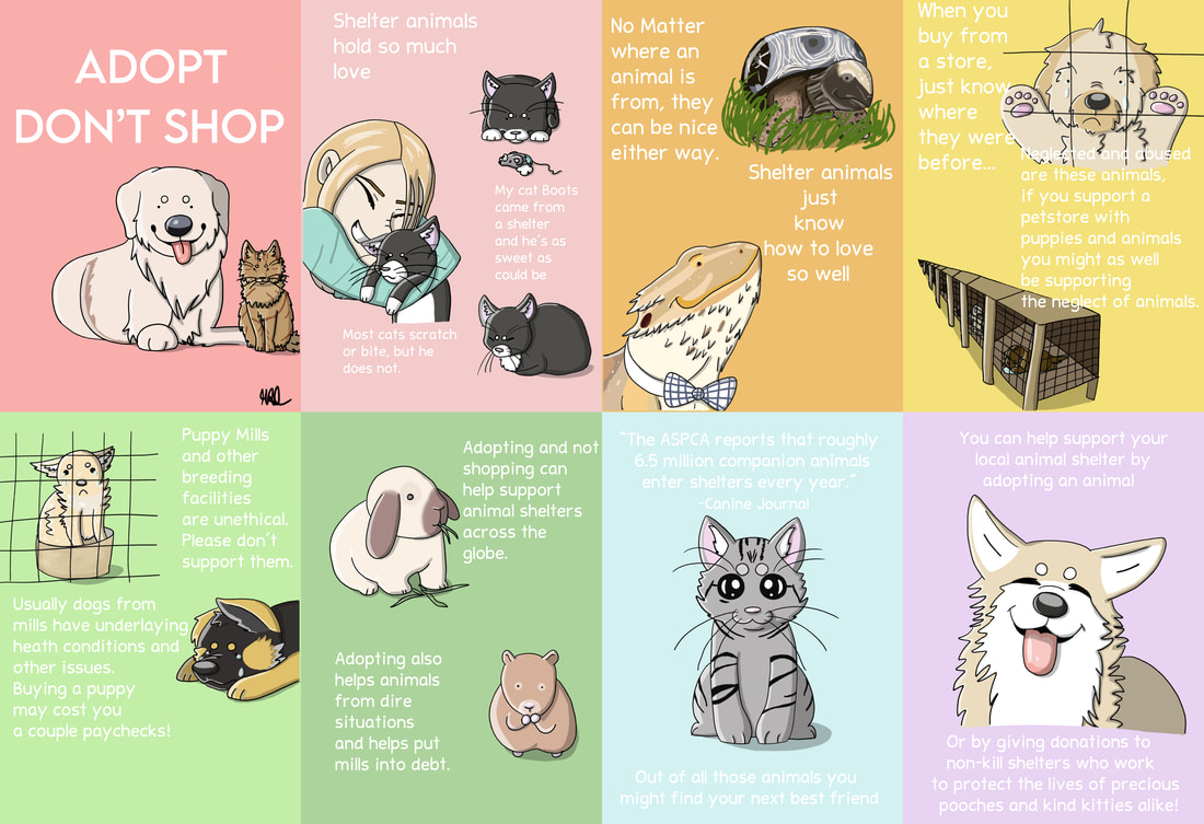
I really love how this one turned out! I really believe that people should adopt animals from a shelter, so I thought that would be an amazing topic to do for this project! Animals usually are abused and neglected when before they get to the pet-store you found them in. I wanted to get that across with that zine and I did! I did well with coloring and shading but struggled with moving and rotating the zines where they are supposed to be.
Saint Card Project
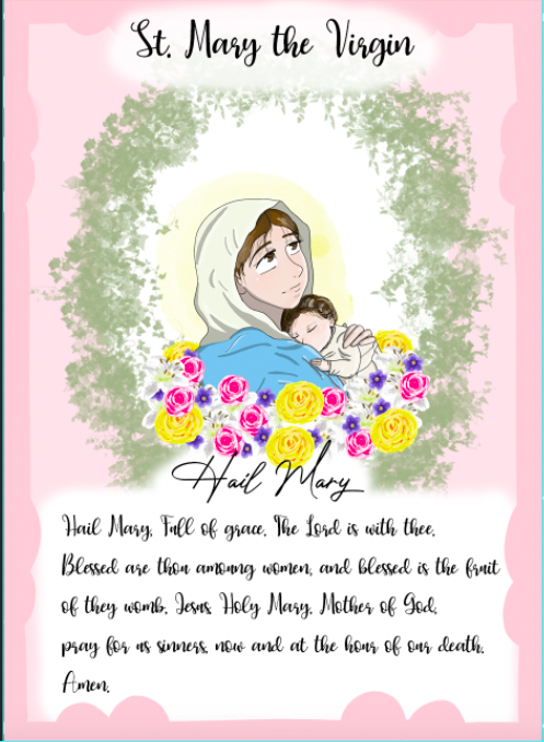
I chose St.Mary the Virgin because she was my confirmation Saint and is very special to me. I added all of the flowers underneath St.Mary because each of these flowers symbolizes a different aspect of her. The White lily symbolizes her purity, the rose symbolizes her love for God, the violet which symbolizes her humility, and the marigold which symbolizes her heavenly glory. I chose soft pinks and greens to contrast the bright colors of the flowers to bring the viewers eyes straight to St.Mary because she is the subject of the card. Something that challenged me with this piece was finding a brush that allows me to make vines like the ones seen around St.Mary. Every vine brush I could find was too big and when made smaller looked like a blob of color. The brush I ended up using worked perfectly though! Something I felt really worked well with this piece was how I put St.Mary in an oval surrounded by vines and flowers. This idea ended up looking very nice, and I am very proud with the finished product!
Oliver & Company Movie Poster
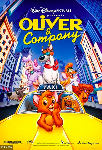
I used all of the main character of the original poster to inform my design. I was mostly challenged with making the characters proportional to their original design and keeping them in their original style. I think the background went really well for this piece. I love the sunset background with the sky scrappers in the middle ground. I used the colors blue, yellow, and red in my design to make viewers of the poster more attracted to it, like all movie posters do.
Chick-Fil-A Billboard
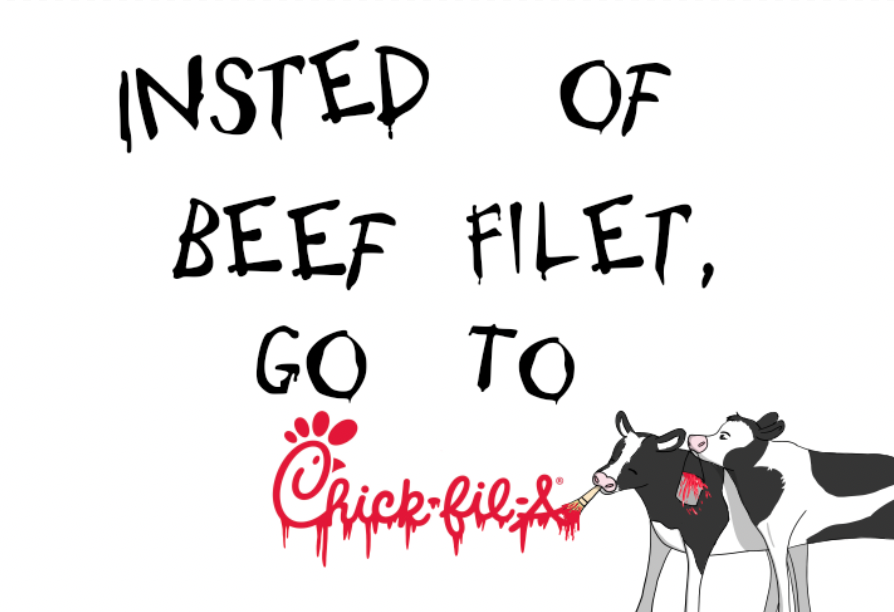
My subject here is how the Chick-Fil-A cow's want you to eat chicken instead of beef, so I showed that by having the cows currently painting the billboard as you are reading it. I feel I communicated the brand in a comedic way, like other Chick-Fil-A posters do. All the misspelling and the cows make the viewer laugh and want to go to Chick-Fil-A. I do believe I followed the 5 second rule, as a driver can quickly realize when glancing at this billboard that its Chick-Fil-A. I would place this sign on a highway by an exit with a Chick-Fil-A because more people travel on highways each day and showing that theres a good food place in the nearest exit will make more hungry people on their way to or from work go there.
