Shape Art Wolf Drawing
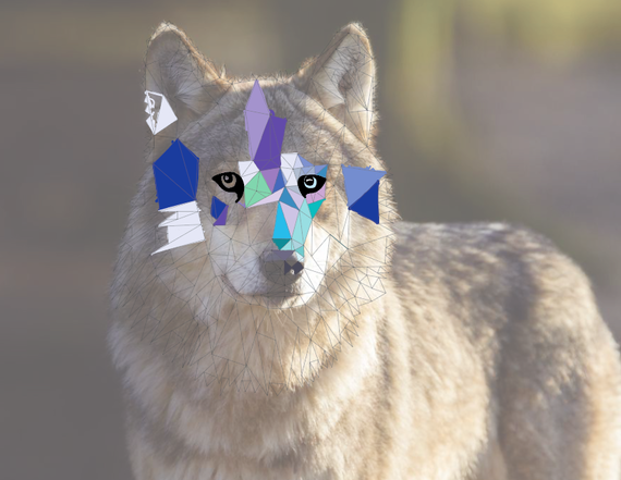
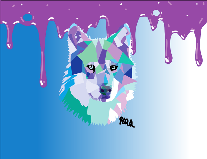
I really enjoyed this project! This project really helped me learn how to use Adobe Illustrator and how to use certain things in it. For example, I learned how to properly use the curvature tool as you can see in the slime dripping in the background and also learned how to properly use the gradient tool, as seen in the background. Also, layers really helped me make everything work and get certain things into the perspective I want. For example, the wolf is on the top layer to make everything else behind it. Overall, I am super proud of how this turned out and am excited to do more like it in the future.
Venturing into the night
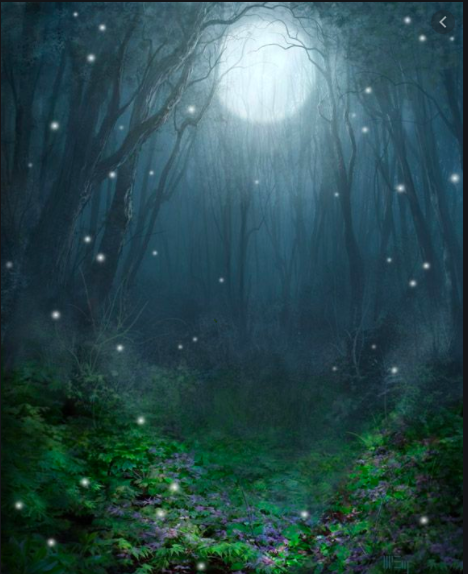
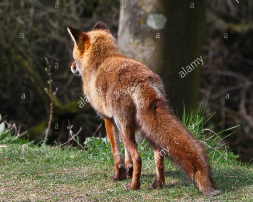
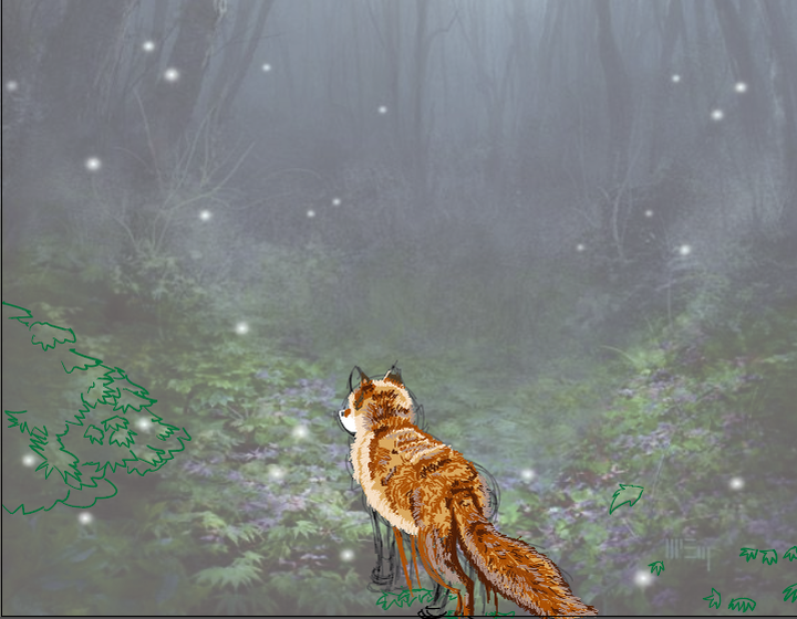
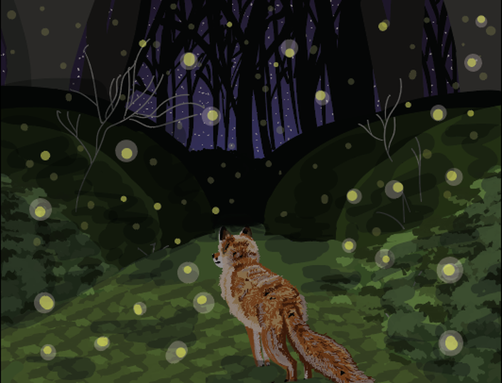
I combined photos and made a unique outcome to show space. I showed space using colors, like brighter colors in the front and darker in the back. I did this completely with the pen tool and the gradient tool. I also changed the opacity on certain objects like the lightning bugs to give them a more glowing look. I also used layers and fine details to show the space in this painting. I used fine lines in the foxes fur to give the viewer the sense that it is the closest to them while everything else is further away. Overall I am very proud of how this turned out, as it looks like it belongs in a children's story book!
Believe in Steven
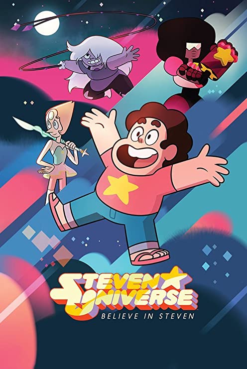
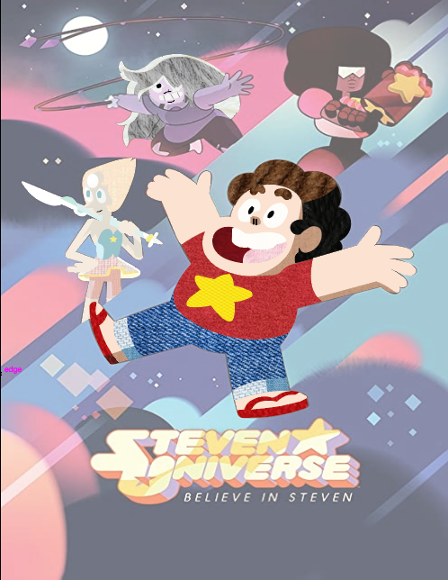
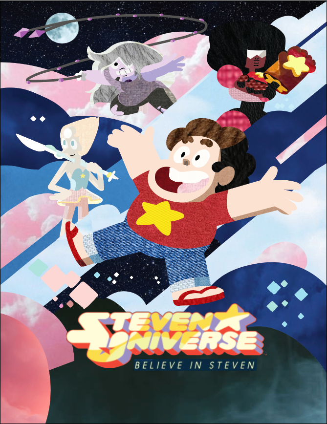
I am so happy with how this turned out! I love all of the textures I used throughout the piece, expecially in Steven's (the little boys) hair. I also added lots of colors that can also be seen throughout this, like the bright pink of some of the clouds. To show that the characters are the main focus of the piece, I used emphasis by using movement in the clouds/background of the piece which is shown with sudden lines and loads of different colors close to one another. I also showed emphasis by using dark colors in certain areas which contrast the brighter ones, leaving the eyes to tend to look at the brighter/softer ones. During this project, I learned how to make multiple different pictures combine into one beautiful piece of art. If I could change anything about this piece, I would maybe make amethysts (purple girls) hair a lighter color of grey. I pushed myself further with this project my forcing myself to learn new things. Also, I used a tool I don't really like to create something I actually like. Overall, I am proud of myself and am totally hanging this on my wall.
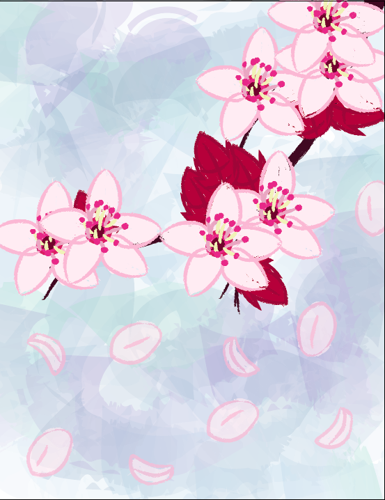
Nature Brush Art- Cherry Blossoms
Lyric Project
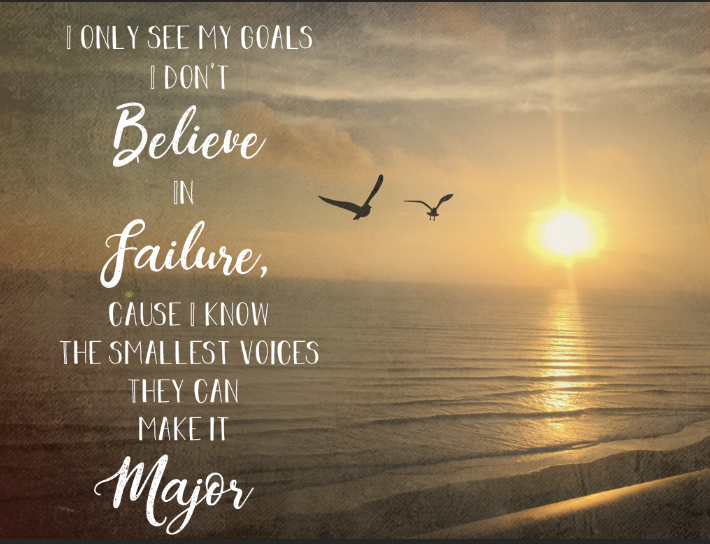
One of the principles I used is movement. The photo shows movement in the waves of the ocean, which helps bring a persons eyes down the photo. Another Principle I used was emphasis. This Is shown with the white of the letters that contrasts the darker background of the photo and matches the bright white of the sun which emphasizes that the letters are the subject of the Piece. The last principle I used was Contrast. Like I said before, I used a bright white in the letters that contrasts the background of the image. I used brush art in the seagulls by the letters. I used a fairly normal brush so I could get the details of them better. I also drew these seagulls in Illustrator. Something that changed in the art as I was working on it was the old timey film on the image. I used a different one before this that was just like a warm tone filter, but I decided that I wanted it to look like an older photo which ended up working quite well.
