Hallway Perspective Drawing
Finished Drawing
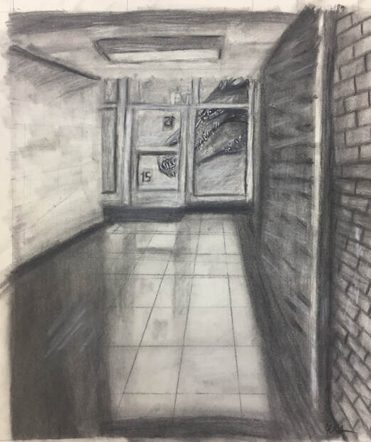
Overall this project turned out okay, I rushed it a little bit, but it still has a lot of good things about it. I did this piece in the back hallways of our school because I am there a lot, as it is easier to get through and I usually like to look out the giant windows to take a look at whats happening in the outside world. Here, the viewer may not want to go outside as there is a giant dragon peering inside the building like it's looking inside a vending machine for a snack. I thought this would be a nice thing to add as I like mystical creatures, and I felt like it would show my personality more in the piece. What helped with my success with this piece was the use of strong value in the shadows and heavy contrast in the dragon and the world around it to bring the viewers eyes to it rather than somewhere else in that area. I also used colors in the eyes to help bing the viewer to the dragon and see that he is looking at you with them and would really enjoy if you would hop into his mouth. Also, I helped show emphasis in the scales of the dragon with the use of a white gel pen around the highlights of him to make it pop more in the grays of this piece. Overall, I would liked to have had put more time in this piece to make it look even better than it does now, but it still turned out okay!
Little Fluffy Dog- Charcoal
Finished Drawing
Close-up Tiger Colored Pencil Drawing
Finished Drawing
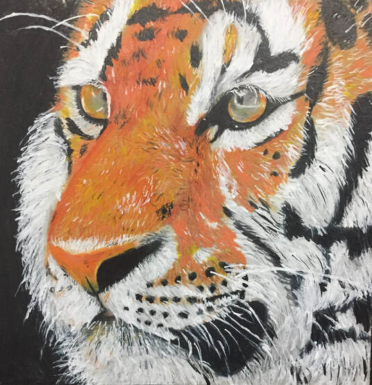
I chose this image of a tiger to draw because I mostly just felt like drawing a tiger. I felt like drawing a tiger because of the bright orange of the fur, and how well it contrasts the black and white of other parts of the drawing. I also find tigers to be super cool, so that also why I chose to draw this. I used black in the background to emphasize that the tiger is the subject of this piece, and nothing else, and kept it the same as it is in the original photo. I also used acrylic paints and gel pens to give the fur more texture in some areas, as before I added them it looked flat and 2-dimensional. To show the bright orange color of the fur I used a lighter tone of orange as the first layer, and layered darker oranges, yellows, and even reds to give it the fire- like tone it had in the original photo. Overall, I am super proud of how it turned out, and am excited for the next piece we are going to get to work on!
Asian Elephant
Finished Piece
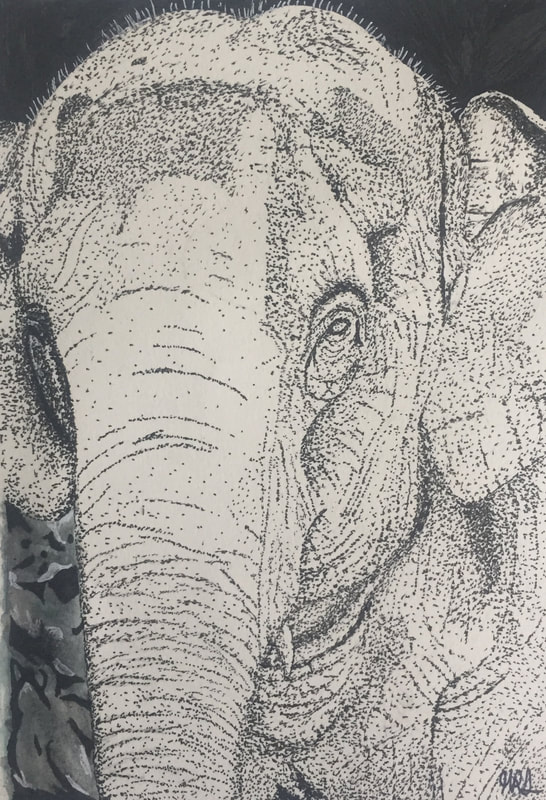
The subject of this piece is an asian elephant. I decided to do an asian elephant because elephants are such peaceful and calm animals, and I really like that. I feel like in a way the artwork symbolizes peace as well. I also decided to do an elephant because they are my favorite animal and I love them! They are always so cute! In the piece overall I used a whole lot of texture and value throughout. It shows texture because of the many dots I used in the elephant (The dots create a rough, wrinkly look in some places in the elephant) and In the background leaves I did. The piece shows value also with the dots and how they are darker and closer together in some places, while in other places they are more spaced out. The artwork also shows contrast and emphasis throughout it. Contrast Is shown by making the background almost completely black. The almost black background contrasts the white of the elephant, which also is why the piece shows emphasis. The white emphasizes that the elephant is the subject of the piece by contrasting the dark black of the background. Overall, this piece turned out super well and I am very proud of it!
Happy Little Fox in Spring- Charcoal/Colored Pencil
Finished Piece
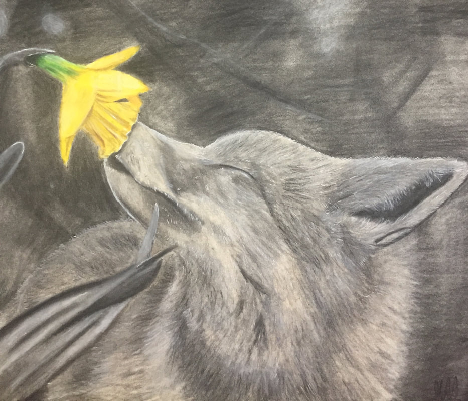
The subject matter I chose for the final project of this class was a cute little fox smelling a bright yellow flower in the spring time. I find foxes to be super fun to draw, so I thought it would be a good idea to do one for the final project! Also, they are such beautiful creatures and just looking at them reminds me of spring. To make this piece, I relied heavily on charcoal pencils and blending stumps. I also wanted to still show the bright yellow color of the flower, so I decided to make it in colored pencil! I also used an orange colored pencil over top of the fur on the fox to contrast the background and to give it a warm, livelier tone. Using the colored pencils on the fox and flower also helped show emphasis on both of them to tell the viewer that those are the subjects of the piece. I also showed the movement of the fur in the fox by using a variety of white art supplies. The first coat I would use the charcoal pencils, next I would use a white charcoal pencil to show lighter areas of fur, then I would go in with a white colored pencil and a white gel pen to show highlights and also to indicate thinner areas of hair. Overall, I am super proud of this piece and I'm super proud of how much better I have gotten at drawing throughout this course.
