Travel Brochure-Tokyo Japan
I showed the theme of my location in my design by sticking with colors that fit the picture seen in the front and back of the Brochure (a kind of night time Tokyo theme). I made sure I used cool colors for the main parts of the design when creating this piece. I also chose to make it this darker theme to fit in with the fact that Japan is one of the neon light capitals of the world besides Las Vegas, and I believe my color palette fit that well.
Coffee Drink Poster
To create this poster I used an image I found off the internet of a Starbucks drink I believed would look like the drink I wanted to create. I put the photo into Photoshop and edited it to make it appear that it belongs in the frosty winter background I created for it. To make it real, I printed out a template of a coffee sleeve I made and glued it onto a cup and took a picture of it.
Animated Gif- The Raven
https://drive.google.com/file/d/14Ky6wvpmJJaAr6lYN_go8IODNjuOQRTO/view?usp=sharing
This Gif is based on a segment from "The Raven" poem by Edward Allen Poe. I based it off of the segment where the main character in the poem opens his window due to hearing a tapping noise coming from outside. When he opens up the window, a raven flies into his house and perches on top of a statue above his doorway. During my experience with animation I learned many new things, especially on how to make it easier on myself. I learned how to use the selection tool and warp tool to easily move and get an object to go in the direction I want it too without completely redrawing it. I also learned how to make an animation look fairly fluent when the frame rate is fairly slow, as when frames are this low smudge frames (or in between frames) don't necessarily look correct. I made it look more fluent by adding less in between frames and instead just adding frames of where I wanted the object to move next directly.
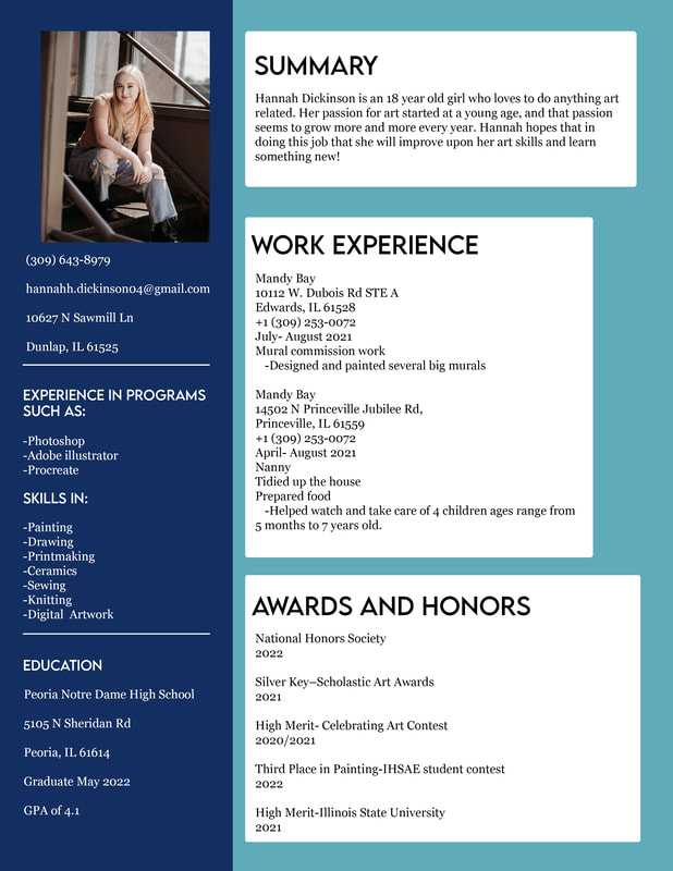
Resume